
Uncategorized
Why Your Designs Look “Cheap”: Understanding Color and Layout Thinking
02
Feb
Feb
You know how to use Photoshop. You know the tools. So why do your designs still feel… off?
The answer isn’t the software. It’s your design thinking.
The Biggest Mistake New Designers Make
Most beginners focus on tools instead of principles. Design quality comes from:
- Color harmony
- Visual hierarchy
- Spacing and alignment
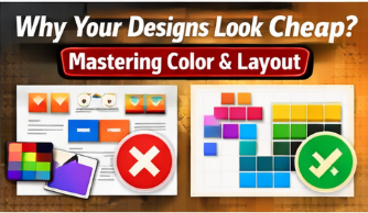
Color: Less Is More
Professional designs usually use:
- 1 primary color
- 1–2 supporting colors
- Neutral tones for balance
Random colors create visual noise and reduce trust.
Layout: Guide the Viewer’s Eye
Strong layouts:
- Have a clear focal point
- Use white space intentionally
- Follow grid systems
Design Thinking vs Tool Skills
Tools help you execute ideas. Thinking helps you create good ideas.
CTA: Want your designs to look premium and professional? Explore our Design Thinking for Designers course today.